This site is 100% hand-coded and designed by Jason Rothwell. No Templates or Frameworks used.
This site uses a responsive and adapted layout I custom built for this application. It is built to optimize the layout and display from mobile devices to large screen monitors. I am employing a technique I developed that uses a combination of omnidirectional scaling, fluid horizontal scaling, and responsive layout. The result is an optimized display that does not leave wasted space, and improves readability.
I believe templates and frameworks have their place. They can significantly speed up a project and save time and money. I have used them and adapted them in my work before. I chose not to use them here because I wanted to showcase my understanding of the technologies involved by building my own, and I wanted behaviors that are not supported out-of-the-box.
I created this site using these technologies:
HTML5
CSS3
JavaScript
JQuery
SVG
Client: Safeco Insurance / Liberty Mutual
Responsible for: Conceptual ideas, element design, and file production
This is the set of icons and button icons used in the Safeco Agent Portal and associated tools. This style adapts a high contrast non-skeuomorphic look.
The icons were drawn using vectors and then exported either as bitmaps or SVGs, depending on needs.
Client: Rothwell Design
Responsible for: Conceptual ideas, element design, and file production
This is a set of icons I designed for my own business website. Each icon represented a service available. Description Coming Soon.
The set was drawn in Illustrator and exported as bitmap to the size needed.
Client: WRQ Inc.
Responsible for: Conceptual ideas, element design, and file production
This diagram style was created to be used in diagrams and book illustrations for both print and online. Its hand-drawn look and high contrast style lent well to the black and white printing of the software manuals.
Although it appears to be hand-drawn, the set was created wholly on the computer as vectors, using Adobe Illustrator.
Client: Giant Campus
Responsible for: Conceptual ideas, element design, and file production
These are subject icons from the Giant Campus Interactive tutorial software. The design objective was to communicate basic ideas and themes to novice users of technology. This solution uses a bright, simple, and soft illustrative style to give and inviting and friendly feel to subjects that might seem intimidating to the end user.
Client: implement.com
Responsible for: Theme design, element design, and file production
As a technology company, implement.com often needs to communicate complex ideas in simple and easily comprehendible ways. A complete and modifiable set of icons became a necessity to achieve this goal. This set was designed to be clear, concise, scalable, and uniquely styled be part of the implement.com brand.
The set was created as a vector set be used in marketing and instructional collateral using tools like Illustrator, Photoshop, and InDesign, and also was converted to a Microsoft Visio set to be used by engineers and developers to assist them in quick creation of technical diagrams.
Client: Attachmate Corporation
Responsible for: Theme design, element design, and file production
The development teams for the Reflection product had decided they wanted to adapt a “Ribbon” style interface, modeled after the conventions used in Microsoft Office 2010 and later, for their new version of their product. The task was to recreate all existing product buttons and create new additions, in a new refreshed and uniquely Attachmate style. The project ended up totaling 110 new buttons created in two different sizes, as needed for the Ribbon UI.
These buttons were all created as vectors in Adobe Illustrator and then imported into Photoshop for production.
Note the crisp display of the smaller sizes. Each size was individually manipulated for optimal presentation.
Client: Attachmate Corporation
Responsible for: Theme design, element design, and file production
Attachmate Corporation had a brand refresh and needed their product icons reflect the new styles . I was given the new brand collateral and was asked to develop a new set of icons, and conventions, for all the product families. Each product line had their own symbol and color associated with them. I used these as starting points and developed a style that would allow for each icon to communicate it's function, while simultaneously communicating what product family they belonged to, as well as the fact that they were all part of the larger Attachmate Suite. This was accomplished by using the corporate "container" shape in the background of each icon. That shape was colored with the product family's color and watermarked with the family's symbol. In the foreground were the symbols to identify specific qualities about the individual files.
These buttons were all created as vectors in Adobe Illustrator and then imported into Photoshop for production. Each icon file contained eight different sizes and resolutions of the image, for optimized display in the OS.
Client: Attachmate Corporation
Responsible for: Theme design, element design, and file production
Terminal interfaces are by nature text based. For Reflection for the Web, the developers wanted to add functionality for procedures and actions that would provide a more modern interaction with these legacy systems. The buttons shown here were developed for the outer chrome of the terminal window. Developers requested that they be monochromatic in color value, to blend more with the outer chrome and not distract from the terminal window.
These buttons were all created as vectors in Adobe Illustrator and then imported into Photoshop for production. Because the toolbar display was customizable by the end user, two sizes were created for each button. The complete set was fifty buttons, in two sizes.
Client: Safeco Insurance
Responsible for: Theme design, element design, and file production
This is a set of icons used to distinguish the different types of insurance products sold by Safeco. They were used for the consumer facing Safeco.com site.
They were created in Adobe Illustrator and finished in PhotoShop.
Client: Safeco Insurance
Responsible for: Design and Production
These are samples of ads I designed for Safeco's agent and consumer web sites. I worked with business owners, web operations, and marketing to make sure imagery and messaging was consistent with our voice, style and brand.
Client: Safeco Insurance
Responsible for: Design and Production
The policy servicing tools for Safeco Employees featured a cross-selling platform that would encourage and reward employees for up selling customers into other products and services. This system named OSCAR (Opportunities for Sales, Commissions And Rewards) used a help character in its presentation. Help characters were a good fit for this tool. The users worked in a competitive and gamification environment where they often used toys and chachkies to keep track of performance etc. We also found in our user research that many user were very fond on the existing character. One woman referred to him as her "little friend".
When I was working on redesigning the servicing tool, I decided to expand the help character to have more variety and options. I wanted to give users the ability to use a character that suited their preferences and tastes, to further increase acceptance and adoption. I designed a preferences UI that allowed users to switch characters whenever they wanted. Seasonal and holiday characters would be added to promote novelty and freshness to the program.
Client: Chinook Communications
Responsible for: Design and Production
Chinook Communications, an email and unified communications provider, was in need of communicating technical concepts to end users and potential customers. These diagrams and info-graphics were developed to communicate those concepts in a consistent and brand-aligned way.
Client: implement.com
Responsible for: Design and Production
Implement.com, an engineering and consulting firm, was in need of communicating technical concepts to end users. These diagrams were developed to communicate those concepts in a consistent and brand-aligned way.
Client: Giant Campus
Responsible for: Conceptualization, Design, and Production
The Computer Basics series of online trainings were geared toward the novice computer user. The diagrams and illustrations in this series needed to be high-level, simple, and friendly in nature. Strong bordered elements with a bright palette helped achieve these goals. These samples are from a variety of subject matter courses.
Client: Microsoft IT
Responsible for: Conceptualization, Design, and Production
These diagrams are samples from many projects developed for Microsoft Corporation's internal IT department. They are all examples of taking complex, and sometimes confusing concepts, and distilling them down to more easily and decipherable communications. They are all produced using Microsoft Visio, the preferred format within Microsoft for technical diagramming.
Client: Microsoft Executive Briefing Center
Responsible for: Conceptualization, Design, and Production
The "Cloud Book" was a hardcopy printed book that outlined the state of the cloud and Microsoft strategies to capitalize on opportunities. The diagrams developed were designed to work well in full color, grayscale, or black and white screened output. These samples show a couple of the designs in both their full color display as well as their grayscale depictions. The color values utilized in the color versions were selected to translate the best when printed without color. This was needed since the client would not know the output method until very late in the production cycle. Redesigning at that point would be too time consuming, so I designed for that possibility from the beginning.
Client: Description Coming Soon.
Responsible for: Description Coming Soon.
This is a collection of parody corporate logos created for the Oscar 2016 website project. These replace well-know character logo images with the image of the Oscar character, done in the same style as the original logo.
These were all created as vectors in Illustrator then converted to SVG. This allowed for loss-less scaling of the logo on the website.
Client: Safeco Insurance
Responsible for: Design and Production of Icons and Ads
These ads were for the consumer facing Safeco.com site. They promoted the bundling options available that could save the consumer money on their insurance. Depending on what product they were reviewing, these ads would communicate that if they combined that product with another, they could receive a discount.
I created the icons for these in Illustrator as vector art. Those vectors were imported into Photoshop for finishing in the ad.
Client: Personal Project
Responsible for: Design and Production
These Pokemon Penguin themed cards were created for a couple kids who loved Pokemon, and their stuffed penguin toy. These were created as Christmas cards. This series is two separate Pokemon evolutions over a four year span. Each year they would get a new Pokemon Christmas card with their character evolved, just like in the real game.
These cards follow the basic Pokemon card design system style. I created these in a combination of Photoshop and Illustrator, with a mix of images I created or photographed, with some stock images as well.
Client: Microsoft
Responsible for: Design and Production
This diagram was created for an internal IT group at Microsoft. They needed a diagram to illustrate the hierarchy and relationship between roles and programs within the organization. They wanted an animation as well as individual stage images to use in multiple presentations and demos.
I created the initial artwork in Illustrator. I then brought it into Photoshop for finishing and creating the animation steps.
Through skill and expertise Jason devised a user experience that is unmatched in the insurance industry segment.David KopetzkyAVP, Online Experience at Liberty Mutual Insurance
[Jason] has always answered to the call of even the most challenging complex design problems with uncanny clarity and innovation.Floris KrügerSenior User Experience Designer at FUJIFILM SonoSite
Jason was collaborative, communicative, and provided valuable insights based on his expertise, making him an excellent UX designer to work with.Harley HoltPrincipal Software Engineer at Johnson & Johnson
At the core of my approach to UX/UI design is a user-centered perspective. Understanding and empathizing with the users of the product/system is vital to designing a successful experience. Aligning those user needs with business requirements is the magic of good UX design in the commercial world. Polishing the look and feel of that experience to align with the brand and CX, while maintaining or enhancing the experience, is where the magic of good UI design happens.
My Design Background
I have had the roles of UX and UI designer both independently and well as combined throughout most of my career. UX design is the discipline of creating a useful and usable experience that’s easily navigated and meets the needs of the user and product owners. UI design, the method used to communicate and expose the UX, is hand-in-hand with the UX. Having experience in both has proved to be invaluable throughout my work experience.
I have worked on UX UI for consumer facing sites and tools, and have accumulated extensive knowledge and expertise in designing for the Enterprise, productivity, and the B2B space. For all projects, I utilize user-centered design processes, principals, and methods, to assure the best possible user experience for those using the product.
In my last four roles I have had the responsibility of Manager and/or Director of UX.
Jason is the UX guy you want leading your team.Ami McElroySVP, Solution Delivery at Liberty Mutual Insurance
I am incredibly lucky to have reported to Jason for four years...Prerna SitomerSr. UX Designer at Johnson & Johnson
Not only does Jason collectively inspire and equip his team to produce exceptional quality work on the whole, but also has a knack for recognizing, nurturing and promoting the strengths of each individual on the team.Floris Krüger Sr. UX Designer at FUJIFILM SonoSite
As a team leader, I see my role as fulfilling two general needs. One is to make sure our team is delivering and acting upon the needs of the business and organization. The other is to support and guide the members on my team to help them flourish to their full potential in their roles and careers. I strive and advocate for an understanding that addressing both of these needs are mutually beneficial to both the employee and the business.
My Roles at Different Companies
While at implement.com I was the Manager of the Build and Tools group where I acted as the lead designer and managed the day-to-day operations of a multi-discipline group of developers and content specialists.
For four years I was the Principal UX UI Designer for Safeco and Liberty Mutual employee and B2B facing tools and portals, where I had directed a team of FTE and contract-based designers to implement a consistent user experience across a whole suite of tools and sites. This was a big-bang project that saw the launching of the whole suite at once. It was a multi-year endeavor and saw the team grow and shrink multiple times. Throughout this process, it had been my role to set the design standards and then assure all members of our design team stay consistent and heading in the same direction. There are lots of moving parts, but we were successful in delivering a best-in-class cohesive experience.
For two years I was manager of the UX Team at FUJIFILM SonoSite. I managed and directed a team of eight UX and Visual Designers in building cutting-edge Point of Care Ultrasound machines and medical records systems.
For the last four years, I have been at Johnson & Johnson where I have been managing a team of designers on the C-SATS SaaS product, and other products in the Digital Solutions division in Ethicon. I am also the lead designer and UX director for C-SATS, where I set standards and oversee the User Experience across the modalities of web, mobile, and embedded devices. I created and manage the C-SATS Design System and Demo environments, and work closely with product management and engineering to assure consistency in experience.
As a designer myself, I feel I have good insight into what designers need and want in their career, and I try to provide that for them. My role has been to set standards and guidelines, but give them latitude for creativity and exploration. I facilitate one-on-one meetings and a whole-group meeting with open discussion. A team that believes in the direction they are going, and feels like their opinions matter and are valued, will achieve much more than one only valued for following directions to a tee.
The teams I have managed have consistently been recognized for achieving above expectations. We have been able to achieve such accolades, because my groups have equaled more than the sum of their parts, because of team coordination, engagement, and commitment to each other's, and the group's, success.
Usability research and testing is key to knowing what your users need and how well your UX UI accomplishes that. I have worked closely with usability specialists over the years and have learned a lot about the discipline and how to apply it. In my last three positions I have had the opportunity to conduct research and write usability scripts myself.
He strongly supported usability and research efforts as we iteratively improved with every user engagement.Kevin SmithPrincipal User Experience Researcher at Liberty Mutual Insurance
Jason was critically important to the successful outcome of a qualitative research study focused on a new surgeon UX being developed. The value of this project was directly the result of Jason's expertise and leadership.Chris Takayama - Director, Digital Solutions at Johnson & Johnson MedTech
Liberty Mutual Insurance launched a very large multi-year project to completely replace its tools for selling and servicing customers. I was involved in, and helped conduct, the user research effort we initiated before we began any design. We traveled the country and observed and interviewed our user base, to find out what they really needed in a new system. We learned how they work, their pain points, and what they like about our current offering. It was eye-opening. As we began designing a new system, we would periodically run by concepts and ideas with panels of end-users to verify our direction. As the project progressed further we would run usability tests with wireframes and later with prototypes. As Principal Designer, I was involved in developing the usability scripts and writing the concluding findings for each test. Overall we conducted over 30 usability tests (times 10- 12 participants per test) for this particular project.
At FUJIFILM SonoSite we implemented a Design Thinking methodology to assure our products remained the top choice for POC ultrasound users. We gained invaluable insights into our users' pain-points and desires in their day-to-day work lives. This methodology was a true differentiator for us in this niche of the medical device and service industry.
During my tenure at Johnson & Johnson, we would conduct user research by visiting surgeon users in their environment to observe and interview, to fully understand their full experience and needs. However, less than a year into beginning work at J& J, the pandemic greatly affected what we were able to do, and our ability to connect with our user base. Additionally, our UX researcher left the company, and we did not get budget to replace the position. I took over leading the UX research efforts for our C-SATS product. We adopted new methodologies and tools in order to continue to get valuable feedback. Over the course of the next few years, I learned the best tools and optimizations in prototypes and script writing to get high-quality feedback and results from our tests and research virtually. As everyone became more accustomed to tools like Zoom and Teams, our process has because quite efficient and valuable.
I have been trained in, and work in, the Agile software development methodology. I have become accustom to Agile’s methods and how they apply to the designer role and deliverables. The relation between design and development has been evolving over the last several years and remains a space where the perfect system is contingent on an organizations overall development preferences.
This diagram illustrates a method I have utilized with our dev teams. Inside each sprint a robust UX process is carried out, but on a smaller-chunked scale than traditional waterfall approach.
The concept of MVP gives the business greater flexibility to decide when a product is ready for release. Because MVP means you're designing and developing in thin slices across the product, at the end of each cycle there is potential for enough functionality to be usable for end-users. For many of the projects I have been involved with, these thin slices are particular workflows I have uncovered through user and SME research.
Everything he touches is honed with a fine polish.Bryan SabolFounder/Content Architect at Crescent Beach Consulting LLC
Jason does tremendous work on a huge array graphics solutions projects.Jason HolmVP of Consulting Operations at implement.com
Visual Design and Graphic Design are important assets to have when working in the other design disciplines. The UI/Visual Design and UX designs tie together to fill out the experience for the end user, so having experience in all aspects has proven to be very valuable and productive.
I have found great value in integrating the Visual Design discipline in all aspects of the UX process. Rather than waiting for wires to be handed off before engaging, I like to have the visual designer part of the user research and UX design reviews. This often reduces the risk of misinterpretations, misunderstandings, and increases speed and efficiency.
There comes a time in the user engagement when having high-fidelity prototypes are beneficial, if not imperative, to gaining quality data. With visual design engaged from early stages, the tests can reveal valuable data as to how the VD layer impacts the functionality and usability for users.
As a software developer, I appreciated Jason's applied knowledge of the relevant web technologies. Jason's absolute super power is his combination of technical knowledge and design wisdom.Harley HoltPrincipal Software Engineer at Johnson & Johnson
Jason was not only an excellent designer... he is also one of the most talented front-end developers I've met.Mike HelmsDirector, eCommerce Integration at Liberty Mutual Insurance
[Jason] does whatever it takes to execute – including providing frontend code to engineering to accelerate implementation.Catherine (Shaw) StachDigital Solutions Lead/ Senior Director at Johnson & Johnson
My front-end development skills were born of necessity. They have been some of the most valuable skills I have added in recent years. Over the past ten years I have advanced my skills in HTML, CSS, and JavaScript to better bridge the gap between design and development.
Our goal in UX is to deliver the best possible user experience for our users. We painstakingly research, ideate and test to hone in on the best solutions. If what engineering actually builds is not the same as what we designed, then we have failed our users. Having these front-end skills has greatly assured that what we design matches what is built.
Years ago I would often see issues arise where I would design a UI that was very usable, tested well, and looked great, but the developer charged with actually building it would often tell me some aspects were difficult to achieve, or not possible at all. Often these developers were primarily back-end developers who were also tasked with the front-end job. Out of a bit of frustration, I committed myself to getting very good at front-end web development. I figured this would help in two ways. First it would guide me to designing UIs and patterns that were practical in their implementation, and second, it would be a proof of concept for the developer, and give them code they could use to jump-start the effort. I have reaped the benefits of this approach over the last several years.
How I applied this at Different Companies
While at at Safeco, I created and maintain a UX UI Toolkit that contained working examples of all of the patterns we used. This Toolkit serves as a reference for final look-and-feel, as well as a code base for how to build it inside the development framework. This asset has been incredibly successful and the key reason why we were able to achieve the designs we wanted in the final production build.
At Fujifilm Sonosite, I was able to step in and create needed embedded prototypes for testing, when our assigned engineer for that was reassigned.
At Johnson & Johnson, I created and maintained a fully functional demo of the product that worked as a demo for sales and support, an engineering resource for interaction samples and code source, an accurate environment for usability studies, and a home for the design system.
This portfolio site is also an example of my front-end dev skills. I built this from scratch, utilizing no templates or frameworks.
Jason Rothwell Portfolio
Sample Projects
About this Site
UX Professional
UX Director
UX/UI Designer
Team Leader
Product Designer
Visual Designer
Rapid Prototyper
Front-end Developer
I am a “Full Stack” UX Design Professional with skills ranging from UX UI Design and Visual Design, to Front-end Development, to User Research and Testing, to Wire-framing and Prototyping, to Team Leader and Director.
Please contact me if you would like to arrange a meeting.
Usability research and testing is key to knowing what your users need and how well your UX UI accomplishes that. I have utilized many methods of user centered design and design thinking to accomplish successful projects.
I have been trained in, and work in, the Agile software development methodology. J&J C-SATS, Liberty Mutual, and FUJIFILM SonoSite adapted this system and converted most of their teams to running Agile.
ManagerUser ResearchUX UI DesignVisual DesignFront-end Dev
For the past 25 years, Bullhorn has dedicated itself to building industry-leading, cloud-based software for the staffing and recruitment industry. Through partnerships with 10,000 customers globally, Bullhorn has built a vast knowledge base of recruitment best practices and deep domain expertise to help firms scale their businesses. Founder-led and headquartered in Boston, Bullhorn employs 1,600 people across 14 countries focused on delivering an incredible customer experience, its core mission.
My Role
As UX Manager at Bullhorn, I manage a team of eight UX designers and am responsible for the UX across all Bullhorn products. The product portfolio is a large offering of solutions, both home-grown and obtained by acquisition.
I am responsible for the UX on the following products:
Career Progression Documentation
One of the first projects I took on as UX Manager was building a career progression framework for the team. The framework defines progression expectations on both the IC track (Designer through Principal) and the Manager track, with depth at each level: competencies, behaviors, and the kinds of outputs that signal readiness to advance. It also bridges UX-specific expectations with Bullhorn's broader leveling, so my designers can be evaluated fairly against company norms while still being held to the standards of the discipline.
This year I updated the framework to integrate AI fluency expectations across every role level. The discipline is changing faster than career documents typically track, and the team's growth path needs to reflect the skills they actually need going forward, not the skills the role required when the document was first written.
Growing the Team
The framework defines the destination at each level. The day-to-day practices that get designers there are where I spend most of my time. I run a full annual review cycle for each direct report, pairing performance evaluation with SMART goal-setting that ties to both individual development and team outcomes. The 1:1s with each designer are where most of the actual coaching happens, week by week.
Direct feedback delivered with care is a craft I treat as one of my own ongoing growth areas. I am explicit with the team about that, partly because giving and receiving feedback is a skill they are developing too, and partly because being open about my own growth invites them to do the same.
Resources and Standards
Each team member brings different experience and skills to Bullhorn, and consistency in how we operate is something I have to design for rather than assume. I have built a set of internal resources to support this: standards documentation covering practices like research facilitation and findings reporting, technical references for designers building their coding skills, and templates for the documents and decks we share internally and with stakeholders. These resources level up the team's baseline and free individual designers to focus their energy on the work itself rather than on reinventing scaffolding.
The BHUX Academy
To promote continued learning and keep the team aligned on key topics, I created an Academy to house our standards documentation and assess the team's comprehension across the subjects. The Academy is a platform I developed to be educational and fun at the same time. It pairs valuable content and quizzes with a humorous, gamified presentation that promotes friendly competition and a more memorable experience. I developed six interaction patterns to vary the quiz content and keep engagement high.
The Academy and the standards documentation it houses have been well received on the UX team. They have also been valuable in building the reputation of UX across the rest of the Bullhorn org, since they promote transparency and communicate UX's function and value clearly.
Cross-Functional Leadership
UX delivers value when it is embedded in the broader product organization, not when it operates as a service desk. I work closely with leaders across Product, Engineering, and Customer Success on shared roadmaps, joint research, and the operating model that determines how design work moves through the company.
A few examples of that work in practice:
I run a leadership UX review that brings cross-functional leaders together on a recurring basis to align on design direction and surface blockers early.
I established an agreed-upon design process with Product and Engineering, and worked through the Jira process itself to guarantee design is inserted at the proper stages of every project, rather than being asked to catch up after decisions have already been made.
I initiated the Silver Bull peer recognition program for the Product organization, which gives anyone in Product a lightweight way to recognize colleagues for work that often goes unseen, and has become part of how the team marks contributions across functions.
The BHUX Intranet Site
To raise the visibility of UX inside Bullhorn and make the team's work more accessible to the rest of the org, I created an intranet site that serves as both a showcase and a knowledge hub. It details the team's capabilities and the services we offer, so any team in the company can see what UX can do for them. The site also catalogs our research findings, leadership meeting recordings, the full persona deck, and the interactive tools we have built around the personas.
The site is hand-coded throughout. I built most of it myself, with additional sections contributed by team members as I taught them HTML, CSS, and JavaScript. It doubles as a learning platform for designers building their coding skills, and as a playground where we experiment with design and interaction patterns before bringing them to product work.
The intranet has been an important channel for the UX team's profile across Bullhorn. It gives partners in product, engineering, and customer success a clear view of what we do and lowers the friction of bringing UX into new initiatives.
AI Utilization
AIManagerUser ResearchUX UI DesignVisual DesignFront-end Dev
How I am using AI at Bullhorn
Two projects from my work leading the BHUX team that show how AI shapes my UX practice today. One turns research into a dynamic part of product development. The other makes the prototype itself the decision tool. The tooling is changing fast, so this is where the practice is today.
Persona refresh and operationalization
Bullhorn's existing personas were five years old and not informing product decisions. The deeper problem was structural: they sat on a wiki where nobody consulted them at the moments they would have mattered.
I used AI as a co-author rather than a drafting assistant. Claude and Gemini independently generated fresh persona sets for the current Bullhorn suite. Each model then examined three sources side by side: its own draft, the other's draft, and our existing five-year-old personas. After several rounds of cross-model critique, I had a draft set ready for SME validation.
The critique loop. Each model evaluated all three sources before recommending changes.
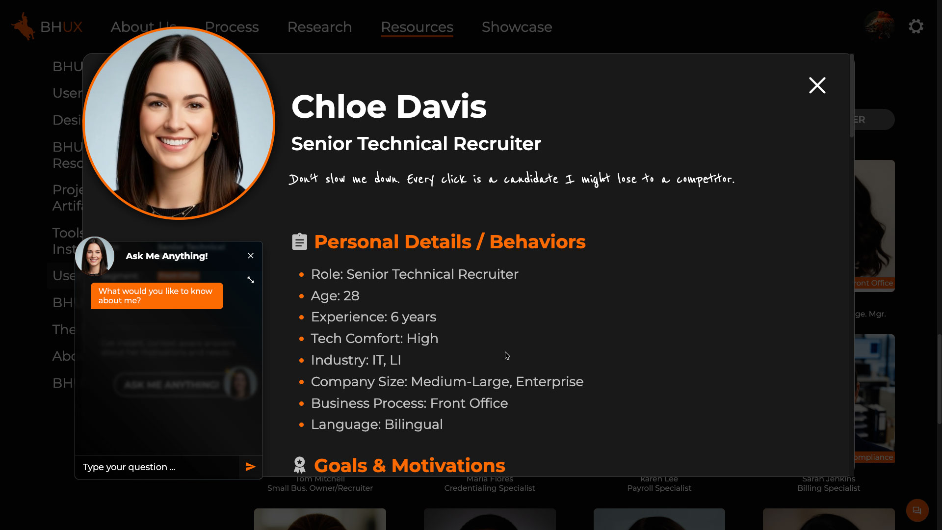
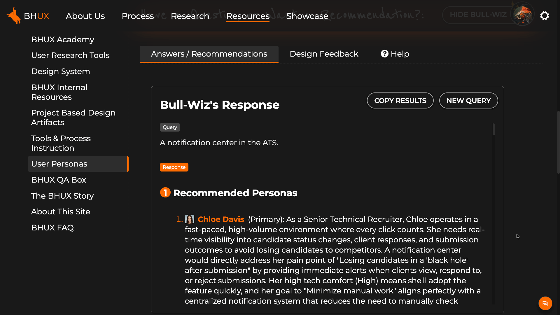
I validated through 20-plus interviews with Customer Success reps, Product Managers, and leadership. The central deliverable across the series was a persona deck, one slide per persona, each with an AI-generated headshot produced in Gemini for visual consistency. AI wrote the research script, consolidated session data, and updated the deck after each interview so the personas evolved across the series. Where SMEs gave conflicting input, AI surfaced the conflict and recommended a consensus position with visible reasoning. The final set was 19 personas covering the Bullhorn suite.
Building Custom AI Tools for the Team
The more interesting work began once the personas existed. To make them dynamic rather than static, I built three tools using Claude as a coding partner:
A persona chat experience. Anyone in the org can ask questions to a specific persona and get answers in that persona's voice.
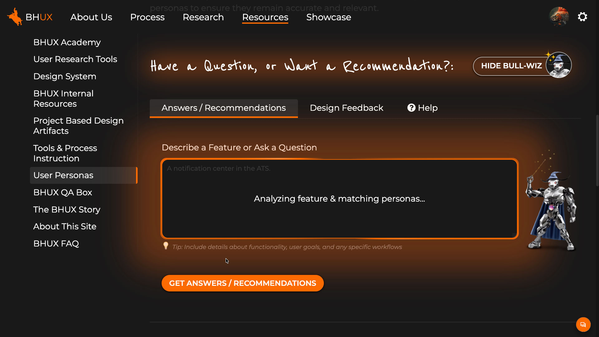
A persona recommendation tool. The user supplies a feature description, requirements doc, or Jira story, and the tool returns the personas most important to consider, with reasoning.
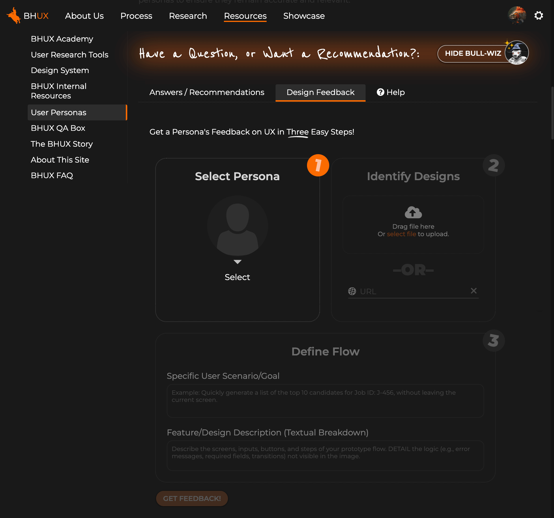
A persona design feedback tool. The user provides screenshots or a URL and a chosen persona responds with that persona's assessment of the design.
What makes these tools more valuable than a typical persona document is that all three have the full interview transcripts loaded as context. The nuance and minority views that did not make the final deck are still in play when the tools generate answers. A persona giving design feedback is not reciting summary attributes, it is drawing on what an actual recruiter said about her day. The personas become a dynamic part of the product development process rather than a static artifact you hope people will reference.
AI-assisted prototyping for design decisions
Static comps make poor decision tools. They look done before they behave done, so user feedback stays shallow. They freeze options in time, so stakeholder reviews circle the same choices. AI-assisted coding lets me build interactive prototypes fast enough that the prototype itself becomes the iteration medium.
The larger of these has been a modernization exploration of the Bullhorn ATS. The product's design system is several years old, and we needed to determine what to change, add, or update to align with current UI and UX conventions. I worked across Claude, Gemini, and ChatGPT to evaluate options and generate ideas, alongside directional input from leadership. I then built a working prototype with Claude, where the build itself was an ideation loop. Claude proposed design solutions, I evaluated them against the design intent and redirected, and the prototype emerged through that exchange rather than from a pre-set design.
The most valuable feature was a control panel built into the prototype that lets viewers toggle options and design treatments on and off. Instead of walking stakeholders through static comp variations in sequence, I could put the prototype in a meeting, switch between treatments live, and let the discussion converge on a direction. The exploration moved from a vague modernization brief to a concrete vision that Product is now taking forward with engineering and the user base.
The prototype is not the deliverable. The decisions it unlocks are.
Across the rest of the work
Beyond these two projects, AI shows up across the team's day-to-day practice. Designers and researchers use it to take notes during user sessions, consolidate findings across studies, surface themes that would otherwise sit buried in raw data, and generate ideas for follow-up exploration. The Search and Match Next Gen research, where I ran 11 sessions across three prototype iterations with junior recruiters, leaned on AI heavily in that synthesis loop. On the management side, I use AI to draft and pressure-test team goals, performance feedback, and the BHUX career framework as it evolves.
The space is moving fast and I am genuinely excited about where it is heading. At the same time, I treat the current generation of tools with clear eyes about what they do well and what they do not. The goal is not to use AI everywhere it could plausibly fit. The goal is to use it where it raises the quality of the work the team ships, and to keep adjusting that line as the tools change.
SaaS Web and Mobile App
Director/ManagerUX UI DesignUsabilityAgile TeamVisual DesignFront-end DevDesign System
Background
My role at Johnson & Johnson is quite varied and dynamic. The division I am part of was previously a small start-up that was acquired by J&J and so there is a blend of start-up and corporate methodology and culture. As such, my role as Sr. Manager of UXUI Design encompasses a broad range of responsibilities, from direction and team management to individual contributor.
The primary products my team is responsible for are what make up the C-SATS platform. C-SATS is designed to help surgeons of all levels improve their proficiency through performance analytics, self-learning opportunities, and peer-to-peer interactions. This platform consisted of a SaaS web app, a mobile app, and an in-OR device.
The web app and OR device are products that originated in 2014, before my tenure. Since joining J&J I have been responsible for a redesign and designing for new features. With a small team, we were able to accomplish results most thought could only be done with a larger team and budget. This was possible because of the full spectrum set of skills and experiences I brought to the team, and the positive and cooperative team environment I was able to foster. Below is an exploration of highlights of this project from a process and systems perspective.
The Product Family
The three main products my design team is responsible for are a SaaS web app, a mobile app, and a device based in the OR to facilitate the recording and uploading of surgeries.
Working Together
Creating software is a collaborative endeavor. Software production for the C-SATS platform can be visualized as a three-legged stool, where each team, Product Management, Design, and Engineering, work closely together to support the development and support for the product. Each discipline's engagement is vital for assuring a quality product and positive user experience.
I worked closely with Product Management and Engineering to develop the following process for feature development. This process maintains our user-centered approach while accommodating real world requirements from the business and development stakeholders.
Demo / Prototype
At the core of our teams alignment on product vision is the C-SATS Demo. The fully functional demo is a design and interaction sample, a source of CSS and code for engineering, and a demo environment for the Commercial and Support teams. I created and maintain the demo by writing raw HTML, CSS, and JavaScript. Its functionality far exceeds prototypes that can be created in tools such as Figma, XD, or Axure, and is less time and resource intensive.
The Demo is configurable to accurately emulate the experience for all user types and personas. It also is used to test out design solutions and act as an accurate and contextual platform for usability testing.
The C-SATS Demo is source of truth for the design team and our cross functional partners.
Design System
The design system I developed for C-SATS is more integrated and complete than you'll typically find. It lives in the C-SATS Demo which assures the design samples and system remain in-sync. It also has direct mapping to an npm (node package manager) that our software engineering team uses for development. This shared component model between the system ensures standardization across design and build.
Our design team also utilizes the Design System and references to keep patterns uniform and minimal. In our design specs, designers will name patterns using the shared component name used in the Design System and shared component library. This promotes consistency, reusability, and engineering efficiencies.
UX Team Artifacts
The UX team hands off two deliverables to Engineering: The Spec and the interaction, visual design, and code samples in the Demo. The UX spec (produced in Figma, or XD) writes out the interaction and display scenarios, contains all variations of language, and references shared components. Each of these artifacts references, and potentially creates references in, the Design System and Product requirements doc.
Keeping the User at the Center
My design team has many contacts with our end users at every stage of product and feature development. Our initial user research helps guide product management in deciding what to build. We then test solutions with representative users in a repetitive and cyclical process refining as we go, until we have high confidence in our solution. We also have multiple avenues of contact with our users once the feature is built to verify it works as expected.
My responsibility as head of the design group for Digital Solutions at J&J is to advocate for the user, illuminate their needs to the business, and find realistic and pragmatic ways to achieve both user and business satisfaction.
Summary
What I describe above is a process and system that was optimal for the C-SATS product suite. This solution and combination of processes is not necessarily the right fit for all product teams. My philosophy is to optimize for the situation and adapt appropriately and pragmatically so we make the best product possible within the given circumstances. For C-SATS, this described system is that.
B2B Suite Redesign
UX UI DesignDirector/ManagerUsabilityAgile TeamVisual DesignFront-end DevDesign System
Note: This project was completed in 2017. While some visual patterns reflect the standards of that time, I continue to include it because of the scale, complexity, and organizational impact of the work. The project involved redesigning a large enterprise ecosystem, establishing UX standards across dozens of applications, and leading teams through a multi-year transformation initiative.
The Challenge
Safeco / Liberty Mutual Insurance needed to migrate off an end-of-life back-end platform that was the backbone for all their enterprise and B2B applications. The organization charged the Safeco Online Experience team (my team) to redesign the entire suite of tools.
These tools accounted for a total of 15 billion dollars in annual revenue. Getting this right for both the Liberty Mutual captive agents, and the Safeco independent agents was imperative.
My Role and Responsibilities
Principal UX/UI Designer
I directed and managed a team of FTE and contract UX designers (fluctuating between 7 and 14 people over 3.5 years)
I helped guide and participated in user research
I set the core design standards and designed the core UX and UI patterns used throughout the suite of tools.
I created and maintained a toolkit of pattern samples and a full working prototype of the portal site that was used in requirements refinement and usability testing.
I designed and participated in usability tests and evaluations.
The Approach
Discovery / Empathizing
We began with a large research project. We sent about twenty people (including myself) from the business group and IT, in groups of two, to visit with agents all around the country. We observed them work and interviewed them about their likes and dislikes in our current system.
Competitive Analysis
There are strict rules in the regulated insurance industry around accessing competitors' business systems. We could not ask directly about our competitors' solutions, but we did catalog general pain points and experiences that our users volunteered on their own. This data was included in our analysis.
We distilled all aquired data to suss-out high level themes with affinity mapping exercises.
Key Observations and Insights
Users do lots of multi-tasking
Too many active windows on screen
Suite of tools are siloed and require separate logins and windows.
Agents don’t want to learn new tools (don’t like change)
Have learned workflow around current tools’ issues
Think Safeco tools are best in class (“don’t change it”)
Speed is crucial.
After price, ease of use of the quoting and servicing tools is most important criteria for independent agents in selecting what insurance line to sell.
Synthesis
Single window experience desired
Make system customer-centric instead of policy-centric
Reduce number of clicks to dive deep
Tie multiple backends into one front end experience.
With this data I worked with our team to create personas to represent our end users.
Defining
To address our findings from research, we defined a new desired architecture that would help alleviate many of the pain points we discovered. Working closely with Software and Business, we defined the following new underlying framework architecture.
This new architecture was a portal type experience. In order to define a sitemap for the portal we utilized surveys, card sorting, and tree testing exercises with end users and internal SMEs.
Ideate, Prototype, Test
With this knowledge in hand we set about conceptualizing the new Agent Portal. We worked with internal SMEs to define key user needs and workflows. As soon as we felt we had a high-level structure in place for the portal, we began our first usability testing, initially using very basic wireframes.
As the testing and evaluations progressed, the prototypes advanced in complexity and detail. In addition to feature prototypes my team built in Axure, I constructed a holistic prototype of the entire portal. To learn more about this project, see the “Explore the Prototype” link below.
We conducted these first few tests within our lab in the office. We invited agents in to try some basic tasks. As we progressed, our ability to get participants to come in person became more challenging. Although not as ideal, we moved to a remote testing model to help accommodate our busy participants work schedules. We initially used Lync and it’s screen sharing/control feature, and later moved to GotoMeeting.
In total we conducted over 30 formal usability studies of user workflows using new designs of the portal and individual features. Each study consisted of between 10 and 12 end users.
The insights gained were invaluable. The cycle of integrating findings and retesting resulted in a robust, intuitive and extensible solution.
The Solution
The one window portal solution combined all content with servicing tools in one window.
The initial release of the new portal required the servicing apps to live in a separate window. This was a software framework limitation that was discovered late in the project. Adaptations were made to make this and the future migration to the target one window UI as seamless as possible. The examples below show the solution for customer servicing tools living in a child window of the parent Safeco Now portal.
The quoting tools are the “cash register” of the business. This tool is a tool our users will use several times day. It needed to be easy to master quickly but also efficient for the power user.
The screen below represents the design solution for a popular user request. Agents wanted to see all autos in a policy side-by-side. This design accommodates that request in a responsive and fluid layout. Results from testing were very positive.
All statuses of the quote are kept in the right gutter. This allows for detailed messaging without distracting the flow of operation.
Helper characters for selling advice had been used on the previous system. User research found they were well received and desired.
Measuring Results
The new software was put through UAT (User Acceptance Testing) prior to release. Some issues around performance were found that needed a front-end solution to mitigate the impact. We made rapid iterative changes during the UAT process to address the situation until it passed acceptance.
We also did workflow/task analysis between the current system and this new one. We measured time to completion and satisfaction. Despite having experience with the current system, for most workflows users were able to complete tasks quicker on the new system and with higher satisfaction than our current offering.
After passing UAT, the new platform began its nation wide rollout. This was planned as a gradual state-by-state rollout over the course of three years.
New Feature Case Study
Director/ManagerUX UI DesignUsabilityAgile TeamVisual DesignFront-end Dev
Background
Through multiple channels, our C-SATS users had expressed the desire to upload their own videos to our cloud, and have them available for assessment, storage, and sharing, just like the videos we capture for them using our in-OR video capture device (CCAP).
This had been a long-term desire from many of our users, but for legal reasons, we were not able to move forward with this project. After rather lengthy negotiations with our legal team at J&J, we finally got the green light, but would need to accommodate some legal requirements.
The Challenge
Accommodating legal requirements, while still making a positive user experience
My Role and Responsibilities
UX Design / Research
I conducted user research
I designed and iterated solutions
I tested with representative users
I created design samples and design spec
I conducted post release research
The Approach
Discovery / Empathizing
Product management had created a requirements doc that documented some user needs, based on previous feedback, as well as the requirements we got from our legal department. I reviewed the documented feedback we had accumulated from prior research and our Salesforce database of reported issues. I decided that because we had a good and recent collection of feedback, that we were ready to begin some iterative designs.
After analyzing the feature requirements, I determined the following personas from our persona group would be the target users.
Competitive Analysis
Video and file uploading is a common process for users in today's web experiences. After researching, I decided that our solution should use existing conventions that our users are likely to already be familiar with. This will reduce friction and cognitive load for this process.
I also did find some common patterns for solutions that required some of the legal requirements we had, but nothing completely equivalent. This would be an area where some novel UX would be needed.
Key Observations and Insights
I found that our users would almost universally be performing this process on their desktop/laptop computers. Interviews revealed that surgeons do not keep recorded videos of their surgeries on their mobile devices. This is primarily because of the size of the videos, and the sensitive PHI material in the videos.
Mobile support would be a lower priority, if supported at all.
I found that surgeons would most likely want to upload multiple videos in one sitting. Like at the end of the week, upload multiples from that week.
I found that some surgeons use editing tools to create videos that combine multiple surgeries
I found that surgeons had a desire to name their videos by unique names, not just procedure name
Synthesis
After reviewing these finding and legal requirements with product management, we agreed on the following:
Upload pattern should support dropping and browsing
UX should allow adding more videos before upload is complete
Video names should match name of file, and be editable
User wants to know status of uploads from anywhere on site
Product Requirement: Promote and make it easy to add case context to video
Legal Requirement: Require user to accept terms and conditions before uploading, once per session
Legal Requirement: Require user to indicate hospital where video was recorded before allowing upload
Defining
Ideate, Prototype, Test
For this feature, I was the designer, prototyper, and usability writer and facilitator. Although it's not ideal to have the designer facilitate a study on their own design, we had to utilize the resources we had at the time. I believe I did a good job of removing my biases from the script and facilitation, and sought feedback from the team to validate.
Ideation
The initial ideation phase involved our product and clinical stakeholders for guidance and feedback. As we worked though concepts and the teams saw potential solutions, some new needs and requirements were discovered.
Below represents some of the first iteration proposals.
Further analysis and review by stakeholders, including legal, resulted in additional fields, and the case context section being added during the upload stage.
The samples below represent the final iteration with SMEs and stakeholders before user testing. As shown below, I put the three sections inside of defined linear steps. This was done to communicate to the users a clear indication of the effort and length of this process, and helped communicate the order of operation of each section that became an emerged requirement from the business and legal.
The third section, Case Context, was added as a requirement to help encourage our users to fill in the optional information. Putting it as a step in a flow was done to subtly nudge the user to do this, as a kind of unwritten expectation, because of the way it was designed.
Prototyping
I built the prototype inside of our C-SATS demo. This allowed us to test inside of the context of the site, and allowed for more complete workflow scenarios.
Testing methodology for this feature
This feature was developed during the COVID-19 pandemic, and so access to our user base was still limited. I determined that internal employees, including our clinical teams, would be appropriate proxies for our users, because this particular feature does not require experience or knowledge specific to our surgeon users. It was more universal.
I had my team help gather ten participants, outside of our product and engineering teams, to reduce bias. We conducted tests via Zoom, by having participants controlling our prototype virtually. I wrote the script and facilitated, while my team took notes and helped consolidate findings.
The screens below, from the findings presentation deck, reveal some of the data revealed.
The Development
There were two handoffs to engineering for this feature; They were the demo, that gave interaction samples and CSS/code for all scenarios, and an Adobe XD spec that described scenarios, interactions, displays, and variations in the UX/UI. Before engineering began work, we reviewed the spec completely with engineering and product management to reveal any missing details or misunderstandings.
During the development sprints, I attended stand-ups and retrospectives for this feature to answer questions and give feedback.
The Solution
I determined that the findings from the usability testing were minor enough to make changes and move forward without the need for further testing at this time.
Below is a recording of the solution of the demo in action. Note, images of surgery are replaced with placeholder images for this portfolio.
Measuring Results
After release, my team and I monitored our users' reception and use of the new feature. We alerted our user base to the new feature using our existing communication channels, so we saw a rather large initial engagement with the feature soon after launch.
We used the tool FullStory to review recorded interactions with the new feature by our users. We also analyzed our Google Analytics and Tableau reports to see if there were emerging issues. In addition, we monitored our support desk and Salesforce tickets for feedback.
I am happy to report that since implementation, we have not found any issues with the user experience of this feature that necessitate any change at this time.
Below are samples of what we reviewed for this feature in FullStory and Google Analytics.
Incorrect Password
ML Data UX Integration
User ResearchUX UI DesignVisual DesignFront-end Dev
Background
The R&D group within J&J MedTech, in coordination with our internal clinical team, were working with our extensive set of our recorded surgeries to explore and discover what insights could be derived utilizing machine learning. This was an exploration to find both what could be revealed, and what would be valuable to our end user surgeons and medical professionals. Several ML models had been created and were at various stages of maturity. These were basically proofs of concept to evaluate what could be done.
The Challenge
My team was tasked to help guide where R&D resources should be prioritized. Developing these ML models would be a large investment of resources, so this research was seen as vitaly important to determine the right direction to move forward in.
These new models would be surfaced in our C-SATS SaaS app, so user-facing solutions would need to be contextualized inside of that experience. Finding the right balance of what data is interesting, valuable, and grokable for our very scientifically minded users would be crucial. They are not the type of user that would be impressed by data unless it had demonstrated value. Displaying data that was not backed up by demonstrated value would damage our reputation and their confidence in our product.
My Role and Responsibilities
Lead Designer
Study Designer
Study Facilitator
Stimuli Creator
Prototype Builder
The Approach
As I evaluated the request from R&D, I realized that there were really two connected evaluations we needed to make with users. One was whether the data in general would be useful, and the other was what display of data made sense. We would need to have a variation of display solutions and contexts to get relevant feedback.
The additional design challenge was to take the best performing designs and find a way of integrating those solutions into the existing UX/UI of the site in way that was efficient and contextualize appropriately.
Discovery / Empathizing
When I first engaged with the team for this project, I was given a list and samples of the areas that R&D and clinical had identified as ML models of value and feasibility. My first order of business was to deep dive into the models to get a deeper understanding of how they worked, and what they were comprised of. I also needed to interview our clinical specialists to understand their reasoning for flagging these areas as potentially valuable for our users.
My high-level inputs an outputs for this project looked like this:
From my interviews with Clinical and Engineering, I uncovered the following findings
Some data had potential value only on individual cases
Some data had potential value only on a collection of cases
Some data had potential value on both individual cases and collections
Some data only made sense when contexualized in a timeframe inside a case
Some data had higher confidence rates than others
Some data might have higher value when combined with others
Utilizing data collected from my internal SMEs, I took a first pass at designing some visualizations, patterns, and interactions for the data. Many had multiple variations of display and integration into the platform.
A small sampling of the individual data visualization patterns:
After validating our understanding of the data, and initial analysis of the validity and value of the designs with SMEs, I went about designing the user evaluation series to be conducted with actual users of the platform.
User Interviews
The UX research method I chose was user interviews with stimulus reaction. To fully understand our users reaction to the stimulus being presented, I asked each user to rate each sample on both the value of the data represented, and then on the comprehensibility of the visualization. In addition I asked them to explain the rating, so as to capture more granular reasons for their reaction.
The stimulus was comprised of both static shots of visualizations in isolation, as well as some in context of the UI.
The Results
Key Observations and Insights
The design and methods of this study proved to be quite successful in revealing important information regarding what users found useful, how they wanted to visualize it, and what additionally they wanted to know about their cases. Some key general findings were:
Some data valuable to early career surgeons, but not valuable at all to later career surgeons
More advanced surgeons increasingly valued a combination of metrics and context over standalone metrics
Visualizations which reveal patterns and orders in practice were valued for standardizing personal processes or teaching trainees.
Almost everyone found value in relating metrics data to specific points in the video of the procedure, and in combination with other metrics
Some metrics were only valuable for certain specialties and not for others
As reflected in the samples below, Displaying high-level info with the ability to drill in was a much desired display, to prevent an overwhelming amount of data, while still capturing main themes.
The video timeline design I created was the most appreciated and desired design solution in the study. The solution elegantly displays a very complex set of data in a quickly digestible visual display. The collapsed version suffices for the majority of the time, but gives enough indication if there is additional valuable data upon expansion.
Study Recommendations
Some general recommendations we made after analyzing the study data were:
Use progressive disclosure of metrics data to allow user to grasp high-level info and drill in at their discretion.
Show metrics in context with others that are relevant (e.g. Idle time in relation to Op time)
Link metrics together to reveal correlations between actions, choices, and results (connect the dots for users – why does it matter?)
Support optimization and/or customization of comparisons and visualizations (e.g. who is a peer, expert selection, and overall or deltas)
Debreif
There were definitely some surprises for our product and engineering teams coming out of this study. Some models that were thought to be very valuable to our end user surgeons just weren’t that impressive to them after all. What was a revelation was that stitching these models together and identifying trends on the combination of models was the desired state for most.
Coming out of this design and research phase, the cross functional teams together identified several roadmap items for product enhancements, and re-prioritization R&D projects in the Machine Learning work. We also approached the phased implementation UX strategy with clarity on what would constitute an MVP release for each phase.
Personal Reflection
I am very proud of what I accomplished in this project, the impact it had, and the appreciation I received. To be able to bridge a connection and solution between three very complex disciplines (machine Learning engineers and researchers, medical clinical experts, and surgeons), and successfully design UX solutions to the satisfaction of all parties involved is an achievement I won't forget, and one that I take the lessons learned forward with me.
Moving Forward
Post study, I was involved in many cross-functional discussions on prioritizing the work going forward. With solid data in hand, I was able to negotiate an acceptable path forward, from the perspective of our users.
The first feature to be released following the study was the Stapling ML model. This was an initial pared down version of what we tested, and what was put on the roadmap. Scope was reduced for technical and timing reasons, but we were confident in this MVP's value, because of the extensive study that was performed.


